ByJohn A
One-Page Checkout vs Multi-Step: Which Converts Better and How to Build Both
| Table of Contents 01 The two checkout layouts, defined 02 What the conversion data actually says 03 The decision matrix: which fits your store 04 When one-page wins 05 When multi-step wins 06 The accordion hybrid: best of both 07 How to build a one-page checkout 08 How to build a multi-step checkout 09 Early email capture and cart recovery 10 A/B testing the two layouts properly 11 What a checkout build costs 12 How to hire for a checkout build 13 Questions buyers ask |
As the Frontend and Conversion Lead at Acquaint Softtech, I get asked to settle the one-page vs multi-step checkout conversion debate on nearly every store we build, and the honest answer is that it depends on your numbers, not on a trend. One-page suits fast, low-value, mobile buys; multi-step suits complex, high-value, or B2B orders.
This article gives the data, a decision matrix, and how to engineer both, so you can choose and build the right one. Getting checkout right is one of the highest-return parts of any custom software product development effort.
The stakes are real. Checkout is where you either capture the traffic you paid for or lose it at the last step, and even a one-second speed improvement can lift conversions measurably. Layout is only part of it; friction is the real enemy, which is why checkout optimization matters more than the page count. Baseline abandonment benchmarks are tracked by the Baymard Institute.
This is the companion to the Complete Guide to E-Commerce Software Development. It draws on real commerce platforms Acquaint Softtech has built as an Official Laravel Partner, with 1,300+ projects, 70+ in-house engineers, and clients across the USA, UK, Europe, Australia, and New Zealand who deploy dedicated teams within 48 hours of a brief.
The two checkout layouts, defined
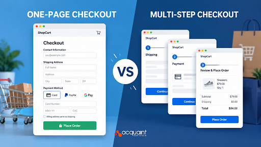
A one-page checkout presents billing, shipping, payment, and order review together on a single screen, so the shopper completes everything without navigating away. A multi-step checkout breaks the same task into sequential screens: contact, then shipping, then payment. Both collect identical information; they differ only in how that information is spread across the page.
It is a layout choice, not a feature choice
The two are the same set of e-commerce payment features arranged differently, which is why neither is inherently better. What changes is the shopper’s perception of effort at each moment. Deciding which arrangement fits your buyers is a core question in modern checkout engineering, and it belongs in the earliest product engineering services conversations.
What the conversion data actually says
The data says context decides. Across published studies, one-page checkout tends to lift conversion for low-value, mobile, impulse purchases, while multi-step tends to win for high-value, complex, or B2B orders. The lifts are real but modest, usually a few percentage points, not the dramatic swings that dogmatic advice implies. Anyone who tells you one layout always wins is ignoring the numbers.
Two findings sit side by side and are both true: switching to one-page has increased conversions for simple, mobile-heavy stores, and multi-step has reduced abandonment on high-consideration purchases by building commitment step by step. The lesson is to match the layout to your average order value, device mix, and buyer type rather than copying a competitor.
The decision matrix: which fits your store
The fastest way to choose is to read your own store against a few factors. The matrix below maps the signals that point toward each layout, and most stores lean clearly one way once they line up their numbers.
| Factor | Lean one-page | Lean multi-step |
| Average order value | Low to mid, under about $150 | High, above about $200 |
| Device mix | Mobile-dominant, returning buyers | Desktop or first-time heavy |
| Product complexity | Simple SKUs, easy shipping | Configurable or complex orders |
| Buyer type | Repeat, familiar shoppers | B2B or high-consideration |
| Analytics need | Basic funnel is enough | Step-by-step drop-off detail |
If most rows point left, a one-page integration will likely convert better; if they point right, multi-step is the safer default. When the signals are mixed, the accordion hybrid covered below is often the answer, and it is the pattern the Acquaint Softtech team reaches for most on new builds.
When one-page wins
One-page checkout wins when speed and familiarity matter most: low-value impulse buys, mobile-dominant traffic, and returning customers with saved details. Fewer page loads and fewer clicks reduce the moments where a shopper can reconsider, and seeing every requirement upfront reassures buyers who just want to be done.
- Fewer page loads and clicks, which cuts abandonment on mobile.
- Everything visible upfront, which suits confident, repeat buyers.
- Fast for low-value carts, where hesitation is the main risk.
The catch is that a one-page layout can feel cluttered and cause scroll fatigue on small screens if it is not carefully designed. Speed also matters: a heavy one-page checkout that loads slowly will convert worse than a fast three-page flow, so performance is part of the design.
Read Also: AI and Human Language Communication
When multi-step wins
Multi-step checkout wins when the purchase needs reassurance and focus: high-value orders, complex or configurable products, and B2B buyers capturing company details. Breaking the task into bite-sized screens reduces the cognitive load of any single moment and builds psychological commitment as the shopper advances, which lowers abandonment on high-consideration buys.
- Lower cognitive load per screen, which helps with longer or complex forms.
- Progressive commitment, where each step invests the shopper further.
- Cleaner step analytics, so you see exactly where buyers drop off.
The trade-off is that every extra step is an exit point, so a multi-step flow only outperforms when each screen is heavily optimized and loads fast. Poorly built, it simply adds friction the shopper feels.
The accordion hybrid: best of both
The accordion checkout is the hybrid that resolves the debate for many stores. It keeps everything on one page, avoiding extra page loads, while revealing each section sequentially so the shopper faces only a small, focused set of inputs at a time. It gets the speed of one-page and the guided focus of multi-step at once.
On mobile especially, an accordion keeps the next action within thumb reach and avoids the endless-form feeling of a long single page. This one-page vs multi-step module pattern is why the debate is often a false binary, and it is a clean piece of payment flow design when built well. Wiring it into the store is commonly handled through software development outsourcing when an in-house team is stretched.
How to build a one-page checkout
Knowing how to implement one-page checkout well comes down to structure and speed. All fields live on one screen, but they must be grouped clearly, validate inline, and stay fast, or the single page becomes a wall of inputs. The pattern below keeps it clean.
- Group into clear sections. Contact, shipping, payment, and review as visually distinct blocks on one page.
- Validate inline. Check each field as the shopper leaves it, so errors never appear only at submit.
- Lead with express pay. Put wallet and one-tap options at the top for returning shoppers.
- Optimize for speed. Lazy-load non-critical parts and keep the page light so it paints fast.
Built this way, a one-page checkout stays scannable rather than overwhelming, which is the difference between the layout helping and hurting.
How to build a multi-step checkout
A multi-step checkout is built as a sequence of small screens that share one state, so progress is never lost between steps. The engineering goal is that moving forward and back feels instant and nothing the shopper typed disappears. Each step should do one job and load quickly.
- Keep shared state. Hold entered data in one place so back and forward never lose input.
- Show a progress indicator. Tell shoppers how many steps remain to reduce uncertainty.
- Capture email first. Save the contact address at step one so abandonment can trigger recovery.
- Make transitions instant. Render steps client-side so moving between them feels immediate.
The frontend for both flows is commonly built when teams hire MERN stack developers who can manage checkout state and validation cleanly across steps.
Early email capture and cart recovery
Whichever layout you pick, capturing the shopper’s email early is one of the highest-return moves in checkout. Multi-step gets this almost for free by asking for contact details first, so an abandonment at a later step still leaves a recoverable lead. One-page needs it engineered deliberately, saving the email on validation rather than only at final submit.
That early capture is what powers recovery emails and turns a lost cart into a second chance. Building it correctly in a one-page flow is a small but important piece of checkout engineering, and technical direction across the checkout is available through a virtual CTO when the team wants a second senior view.
A/B test the two layouts properly
The only way to know which layout converts better for your store is a proper A/B test, not a guess. Run both against your real traffic with a single primary metric, completed orders, and a sample large enough over a window long enough to clear weekly and payday cycles. Anything shorter measures noise, not truth.
- One primary metric: completed orders, not clicks or time on page.
- Run long enough to cover at least two full weekly and payday cycles.
- Segment by device since mobile and desktop often disagree on the winner.
What a checkout build costs
The payment module cost in India depends on which layout you build, how many payment methods you support, and whether you want A/B testing and recovery built in. The figures below reflect typical ranges to design and build the checkout, separate from gateway fees.
A custom payment integration India-based build sits well below Western agency pricing for equivalent seniority.
| Scope | What it includes | Typical range (USD) |
| One-page checkout | Single-page flow, inline validation, express pay | $3,000 to $7,000 |
| Multi-step checkout | Stepped flow, shared state, progress, email capture | $4,000 to $9,000 |
| Accordion hybrid | One-page with sequential reveal, mobile-tuned | $6,000 to $12,000 |
| Full build plus testing | Above with A/B testing and cart recovery | $12,000 to $25,000 |
Where the real savings are
The layout is cheap; the optimization, testing, and recovery are where value is made. A build checkout system with an India-based team lands at up to 40% cost savings versus Western agencies, with blended rates of roughly $20 to $45 per hour.
When you hire developers for checkout work, judge them on state handling, validation, and testing rigor, not on how fast they style a form. A full domain-ready pod is delivered as a dedicated development team.
How to hire for a checkout build
The right hire for a checkout build understands three things: clean state and validation across a flow, mobile-first performance, and how to design and read an A/B test. A generic developer can build a form, but conversion is a craft, and it decides whether the checkout captures the traffic you paid for or leaks it.
Look for engineers who have shipped and tested real checkouts, because conversion lessons come from live traffic, not tutorials. Scoping the work correctly first is the job of a short discovery workshop, and ongoing tuning after launch is handled through support and maintenance.
Proof: an A/B test that settled the debate
The cleanest proof is a real test. Acquaint Softtech rebuilt and A/B tested checkout for an apparel store on Lampoo’s platform, running one-page against multi-step on live traffic.
This account is drawn from the client’s verified 5.0 out of 5 Clutch review, and the card below summarizes the test and its result.
| Test parameter | Detail |
| Variants | One-page vs multi-step, same fields |
| Primary metric | Completed orders |
| Traffic split | 50 / 50, live shoppers |
| Segment | Mobile-dominant, low-to-mid AOV |
| Result | One-page won on mobile; multi-step held on high-value desktop carts |
| Decision | Ship accordion hybrid, device-aware |
The test refused to give a single winner, which was the point: mobile shoppers converted better on one-page, while higher-value desktop carts held up on multi-step. The team shipped an accordion hybrid that served the right experience per device, and order processing ran on a Laravel asynchronous queue so checkout never stalled. The lesson is that the layout question is answered by your data, not by an opinion, and the winner is often a hybrid.
Expert insight from Sagar P, Frontend and Conversion Lead
Questions buyers ask
What is one-page checkout?
One-page checkout presents every checkout element, billing, shipping, payment, and order review, on a single screen, so the shopper completes the purchase without navigating to separate pages. It reduces clicks and page loads, which suits fast, low-value, mobile purchases and returning buyers, though it can feel cluttered if the single page is not designed carefully.
What is a checkout page?
A checkout page is where a shopper completes a purchase, entering contact, shipping, and payment details and confirming the order. It is the final and most important step of an e-commerce funnel, because this is where paid-for traffic either converts or abandons. Checkout can be one page or several steps, but its job is always to turn intent into a completed order.
How do you design a checkout page?
Design a checkout page to reduce friction: enable guest checkout, keep fields minimal, validate inline, show trusted payment options, and lead with express pay for returning buyers. Choose one-page for simple, mobile, low-value carts and multi-step for complex or high-value orders. Keep it fast and mobile-first, and capture the email early so abandoned carts are recoverable.
How does one-page checkout work for e-commerce?
One-page checkout works by rendering all required fields on a single screen and completing the order without page transitions. The shopper fills in contact, shipping, and payment in grouped sections, sees the order summary alongside, and pays in place. Fewer loads and clicks reduce moments of hesitation, which lifts conversion for low-value, mobile, and repeat purchases.
How do you implement one-page checkout?
Group fields into clear sections on one page, validate each field inline as the shopper leaves it, and lead with express payment options for speed. Keep the page light so it loads fast, save the email on validation for recovery, and consider an accordion that reveals sections sequentially on mobile. Test it against a multi-step variant before committing.
What are the best practices for checkout?
Enable guest checkout, minimize fields, validate inline, and lead with express and trusted payment methods. Match the layout to your data: one-page for simple, mobile, low-value carts, multi-step for complex or high-value orders, and an accordion hybrid when signals are mixed. Capture email early, keep it fast and mobile-first, and A/B test with completed orders as the metric.
What is the development cost?
A one-page checkout typically runs about $3,000 to $7,000, a multi-step checkout $4,000 to $9,000, and a full build with A/B testing and recovery $12,000 to $25,000, separate from gateway fees. An India-based team delivers the same work at up to 40% below Western agency rates, with blended rates near $20 to $45 per hour.
Which converts better, one-page or multi-step?
Neither wins universally. One-page converts better for low-value, mobile, impulse, and repeat purchases; multi-step converts better for high-value, complex, or B2B orders that benefit from structure and reassurance. The lifts are usually a few percentage points. The reliable answer is to A/B test both on your real traffic, since the winner depends on your store.